TL;DR
When I joined Malo (now Heloa) in December 2022, the product had no design system, static illustrations that couldn't scale, and a brand identity that no longer matched the company's ambitions.
Over three years, I built and led the design function through three foundational transformations: creating a design system from scratch, replacing rigid illustrations with a modular system built for inclusivity, and facilitating a full rebrand from Malo to Heloa. Along the way, I restructured the team around a model where designers owned the entire product scope — research, specs, delivery, and metrics — without Product Managers.
Structuring a Designer-Led Product Organisation
From PM departure to a new model
When the Head of Product and the PM left, we struggled to replace them. But as weeks turned into months, something became clear: Mathilde and I were already carrying the full product scope between us. Rather than fight to fill roles whose responsibilities were already being handled, I formalised the model we'd fallen into.
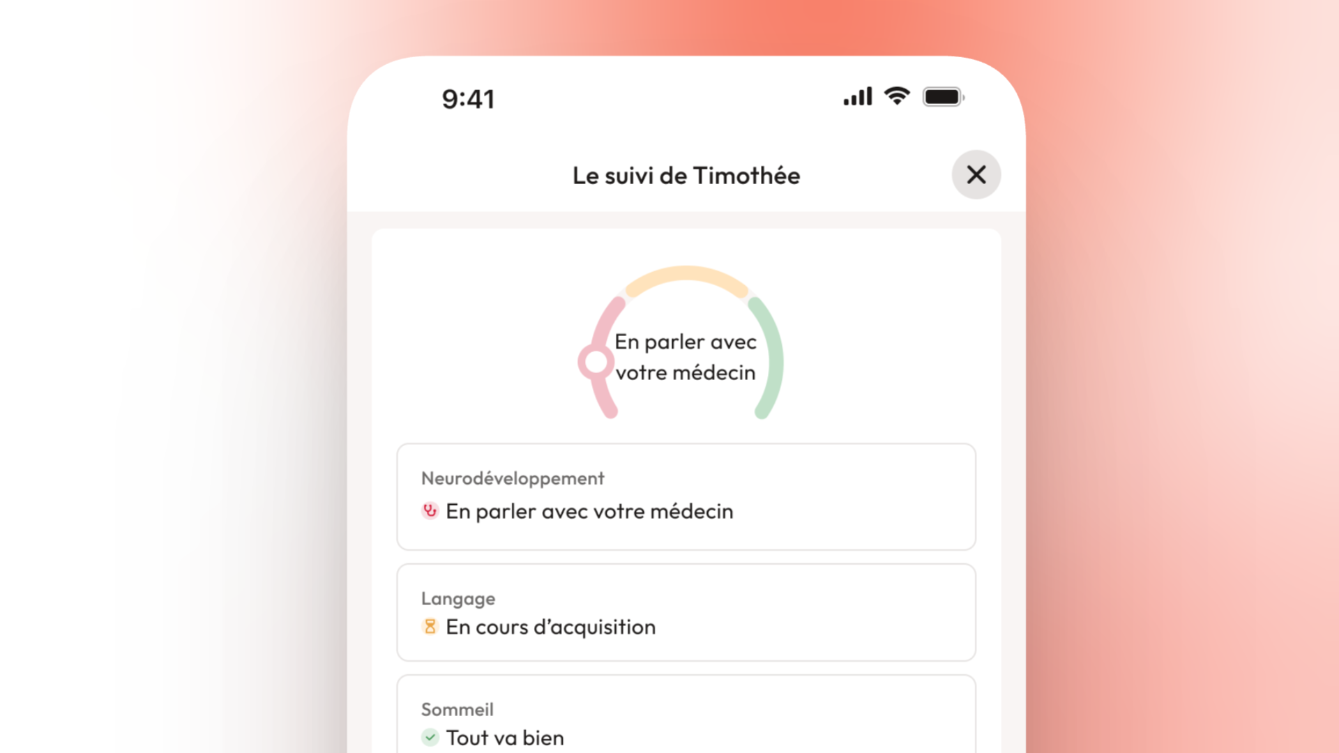
Each designer owned their projects end to end — from discovery to post-launch measurement. They analysed data, defined measurable objectives, designed solutions, wrote specifications, followed development, and tracked outcomes. Fanny, our Product & Brand Designer, put it well after creating her first tracking dashboard: "I can see the result of my work immediately. Whether I'm hitting my goals or need to go back and do more research."
Repositioning a team member
Our UX writer, Mathilde, had joined before me to reformulate medical articles for the blog. I saw someone with deep knowledge of our users' language, our medical content pipeline, and the product's written layer — which made up roughly 80% of the app. I repositioned her as a Content Designer: same scope as a product designer, different lens.
This wasn't ideological — it was practical. In a health app for parents, the wrong word can cause panic. The right word can mean a child gets seen by a doctor sooner.
Building a career framework
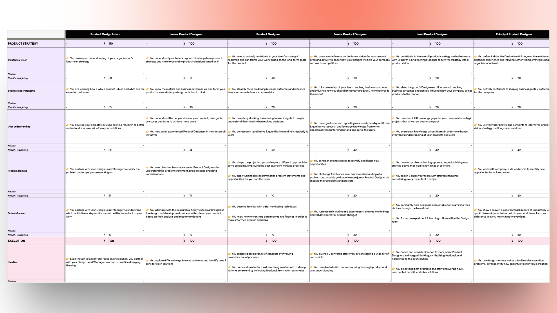
The "no PM, designers own everything" model created a specific challenge: how do you evaluate and grow people in a role that doesn't map to standard industry frameworks?
I built a career path framework with three distinct tracks: Product Designer, Brand Designer, and Content Designer. Each track spans from Intern to Principal, structured around four categories — Ownership, Product Strategy, Execution, and Behaviours — with weighted skills inside each.
Building a Design System When No One Sees the Need
The problem
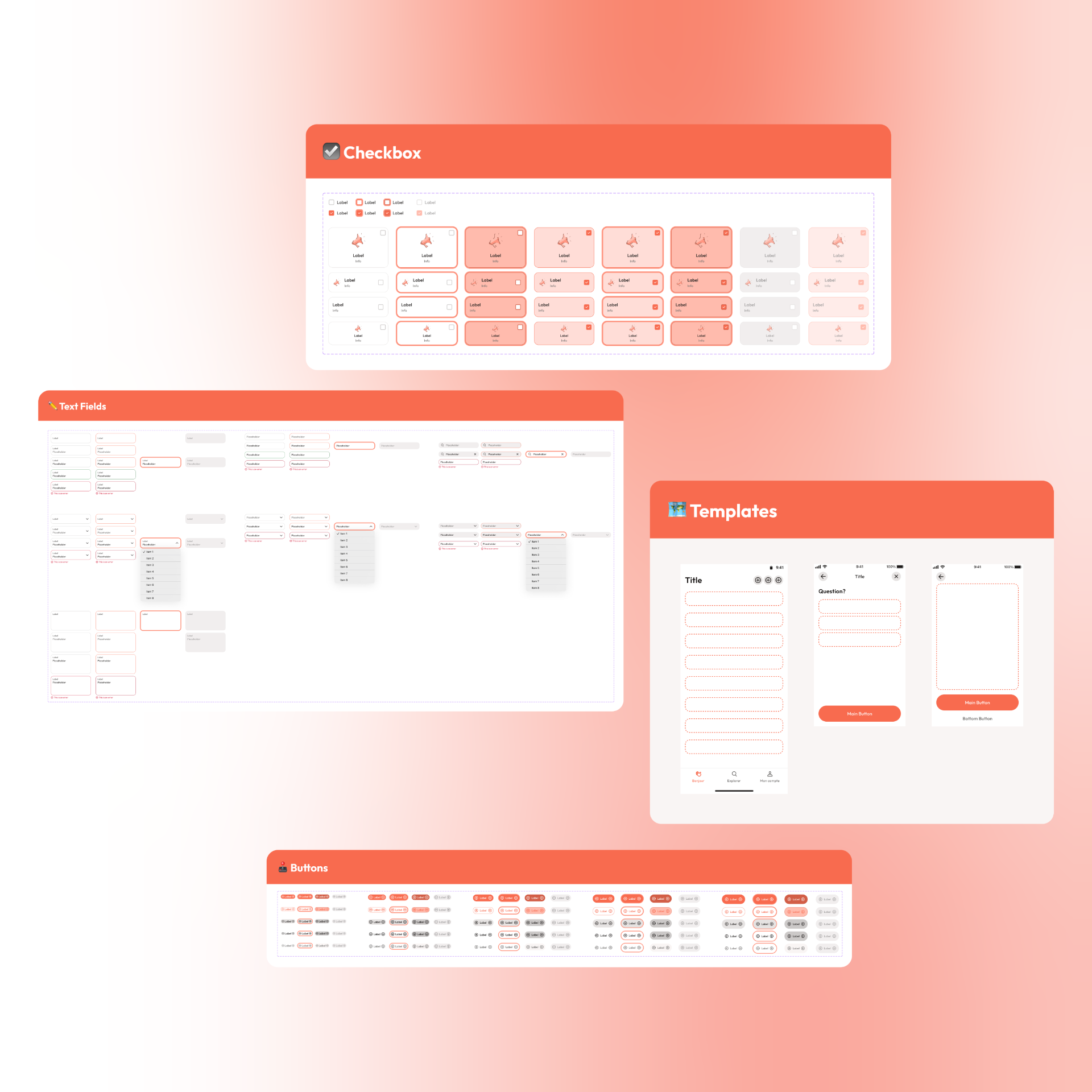
When I arrived, there was nothing in Figma. No components, no shared styles, no tokens. On the development side, a single button component existed — everything else was built ad hoc. For a B2C health app where trust is the core currency, visual inconsistency reads as unprofessionalism.
What I did
I built the design system incrementally — not as a standalone project, but woven into every feature we shipped. Every time we touched an interface, I replaced the ad hoc implementation with a proper component.
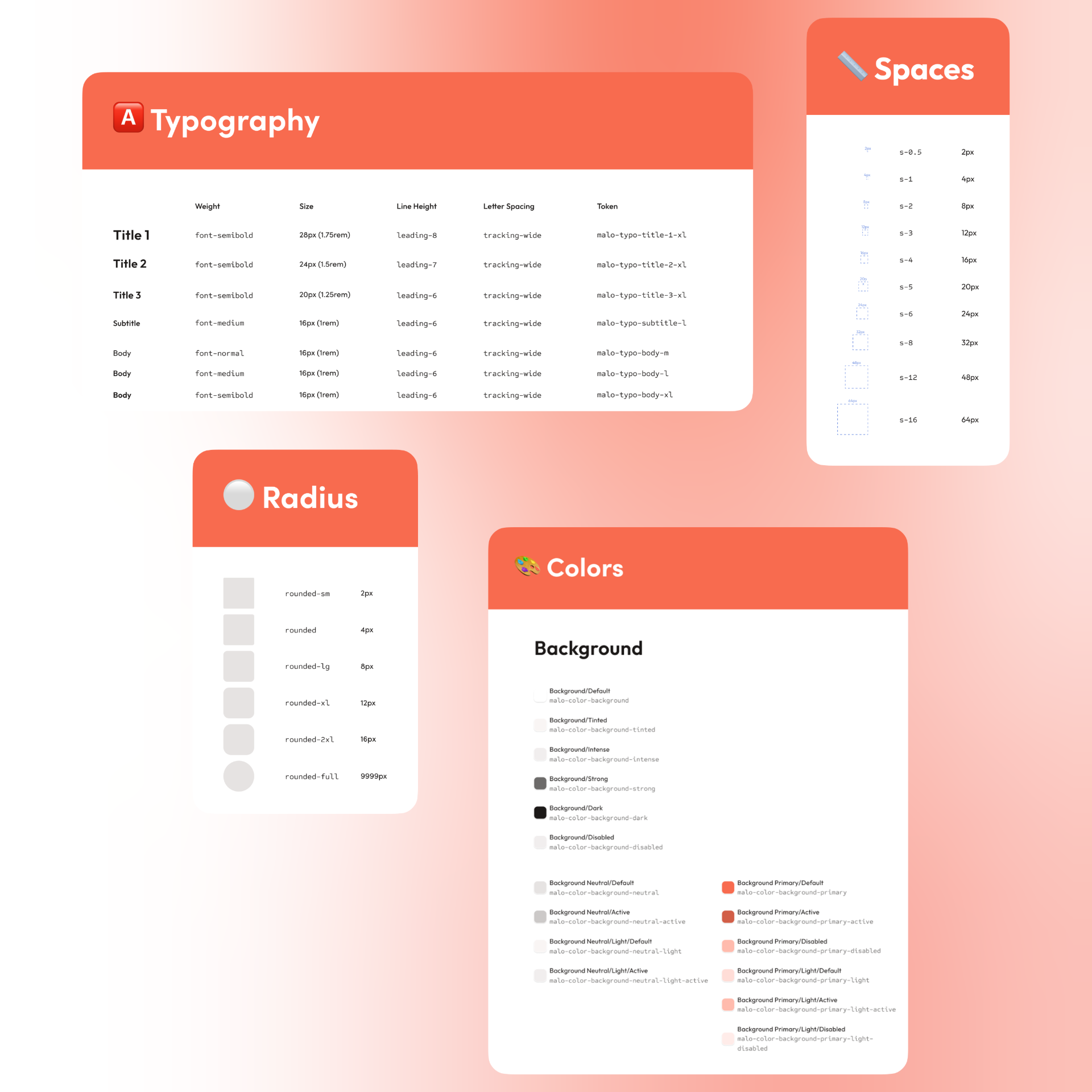
On the Figma side: buttons, inputs, cards, modals, navigation patterns, typography scales, colour tokens, spacing rules. Mathilde contributed the content guidelines — tone rules and terminology decisions that had previously been debated for hours with no resolution.
The resistance — and the result
The developers didn't see the point at first. The value is invisible until you've accumulated enough components that velocity genuinely changes.
One of our developers told me later: "You never let go. We didn't understand why at the time, but now we have a product that's impeccable."
Replacing Static Illustrations With a Modular System
Three problems at once
Our illustrations were a growing liability:
- Inclusivity. Realistic illustrations force you to depict specific people — someone always doesn't see themselves. We couldn't produce enough variations to be truly inclusive.
- Cost and speed. Every new illustration was a one-off production — a bottleneck that got worse as the company grew.
- Visual integration. Detailed, photorealistic illustrations sitting next to clean UI components created visual dissonance.
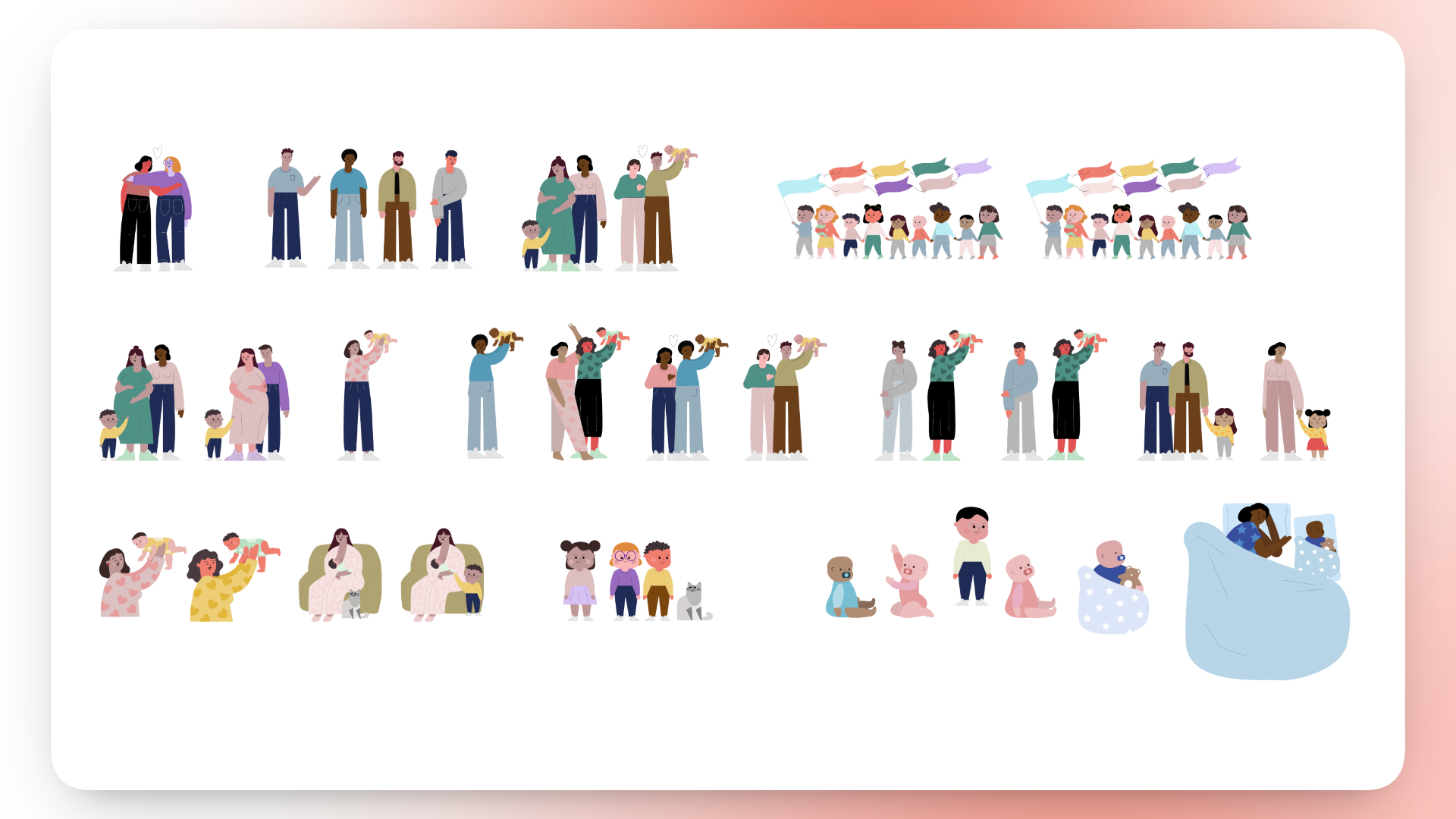
Finding the approach
The solution came from a YouTube video. A designer named Fanny Mialon had filmed the process of creating a modular illustration kit — characters built from interchangeable components (heads, bodies, legs, hairstyles, expressions, accessories). The same principle as a UI component library: define the building blocks, and let anyone compose what they need.
I reached out to Fanny and brought her in as a freelancer. We spent 5–6 sessions defining the foundation before she built the system in Figma.
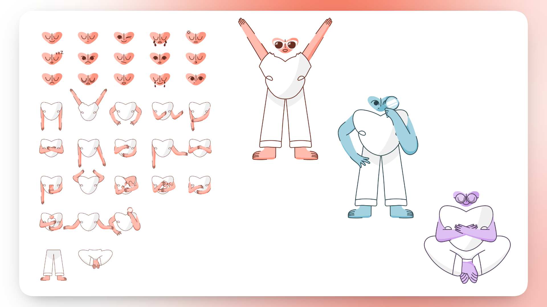
The marketing team went from "I need an illustration, can someone design one?" to "I'll build it myself in 10 minutes."
The collaboration worked so well that I recruited Fanny full-time as a Brand & Product Designer.
Protecting the Rebrand: From Malo to Heloa
The name "Malo" had become a liability — it sounded masculine in French, and "malo" means "bad" in Spanish. Before any creative work started, we scoped the rebrand tightly: change the name and logo, keep everything else.
My role was not to design the new brand — that was Fanny's job. My role was to create the conditions for her to do that work well: filtering noise from leadership, shutting down unproductive debates, and being available without hovering.
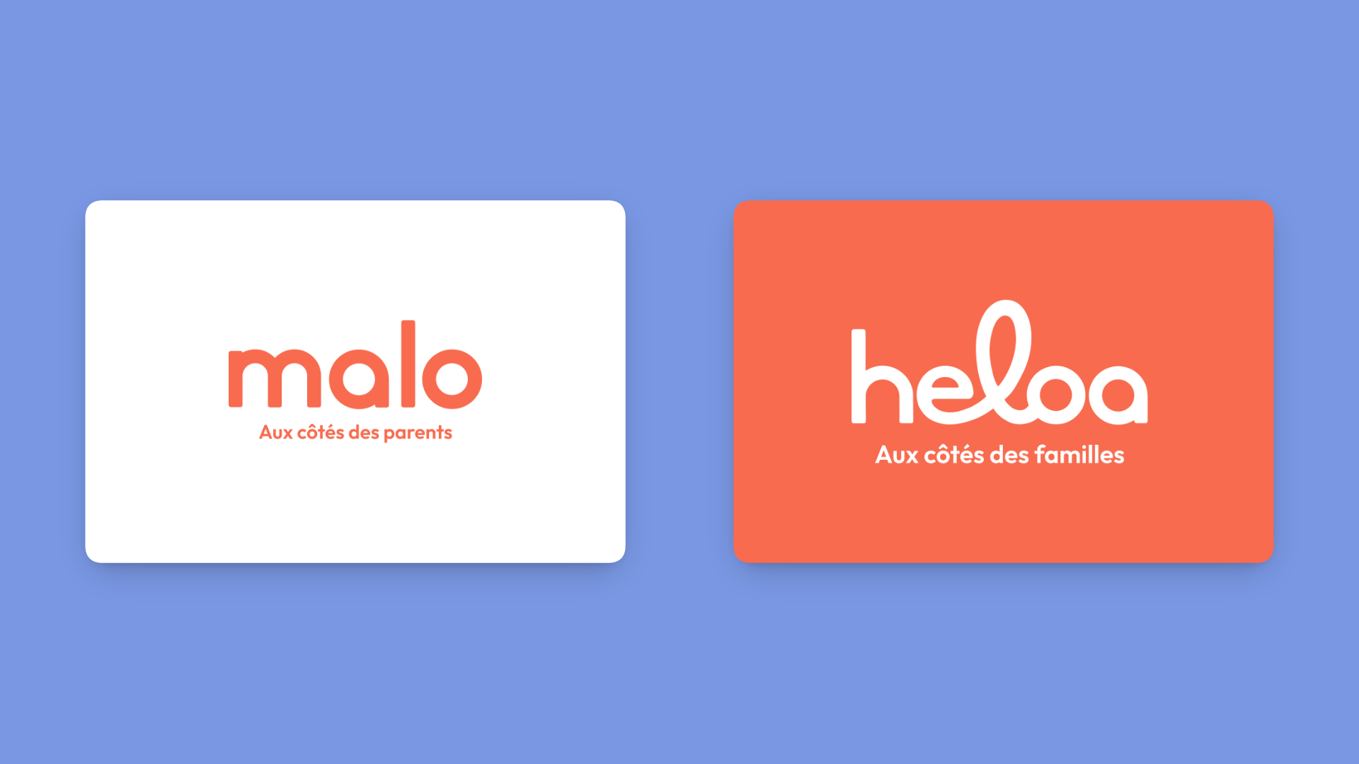
The rebrand shipped. Malo became Heloa — ready for international expansion — without derailing the product roadmap.
Outcomes
- A design-led product organisation. Three designers owned the entire product scope. No handoff friction, no translation layer.
- A functioning design system where there was none. New features shipped faster and looked consistent by default.
- An illustration system that scales. Marketing produced visuals autonomously. Any family configuration representable without custom work.
- A successful rebrand. Malo became Heloa, with the design foundations built over two years carried over intact.
What I'd Do Differently
I underestimated how much the "no PM" model depended on me. The connective tissue — roadmap, priorities, stakeholder alignment — was hard to transfer. I should have made more of it explicit earlier.
I should have documented the design system earlier. The reasoning behind decisions lived mostly in my head. A proper documentation layer would have made the system more resilient.
The illustration system needed more iteration than expected. We started with 10 colour palettes and 5 stroke-weight variants. The flexibility created complexity. We ended up simplifying and building custom Figma plugins — which ultimately made it faster than the original design.